Concept 2026 · SaaS & startups
Relay
A SaaS homepage that lets the product explain itself
Brand Identity first
The brand came before the build.
Three stacked bars and a dot: steps handing off to each other, the way a workflow does. Hot orange and black, made to hold up in a workflow builder, an app icon and a billboard.
- #FF5A1F
- #FFB199
- #111111
- #F4F4F4
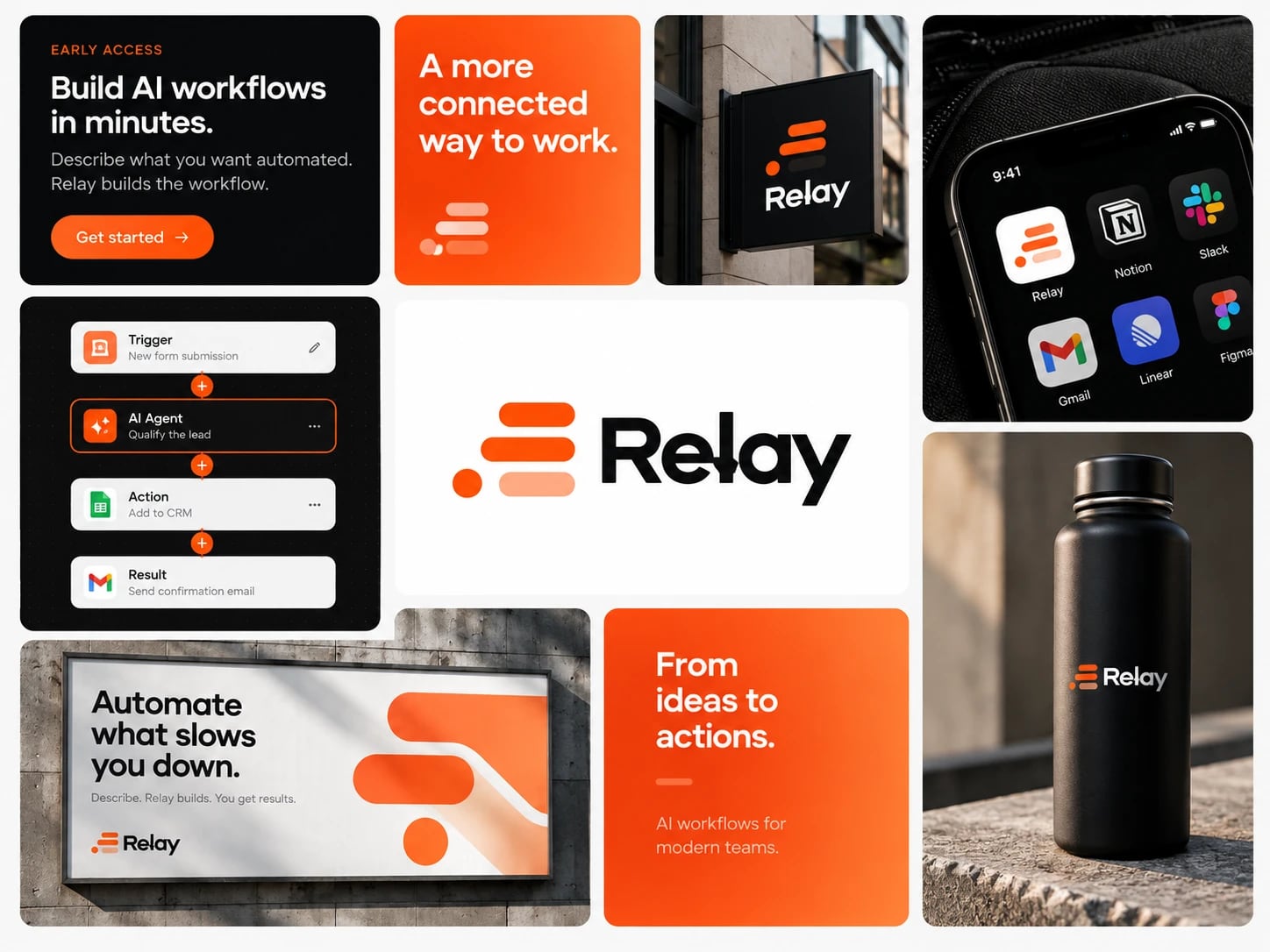 View full board ↗
Story Case study
Overview
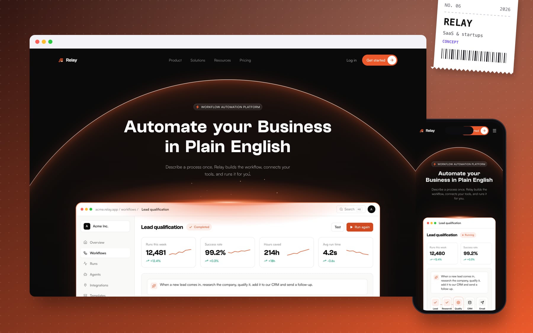
Relay is a workflow automation platform: you describe a process in plain English, and Relay builds the workflow, connects your tools and runs it. This SaaS homepage design tells that story in one scroll, with the product's own interface doing most of the explaining.
The challenge
Automation and AI tools tend to reach for the same look: purple gradients, glowing orbs and abstract shapes. Relay needed to stand apart from that and, more importantly, make an abstract idea concrete: what actually happens between typing a sentence and the work getting done. The goal was for visitors to understand the product from the UI itself.
What I built
- A dark hero with a light, three-column product dashboard beneath the headline "Automate your business in plain English"
- A problem-and-solution section comparing "your week, today" with "your week, with Relay"
- A workflow builder that steps through real examples such as lead qualification and support triage
- An AI agents section ("Give every workflow a brain") with example agents like a lead researcher and an invoice reader
- A capabilities bento grid where clicking a building block (triggers, agents, logic, approvals, observability) shows what it does
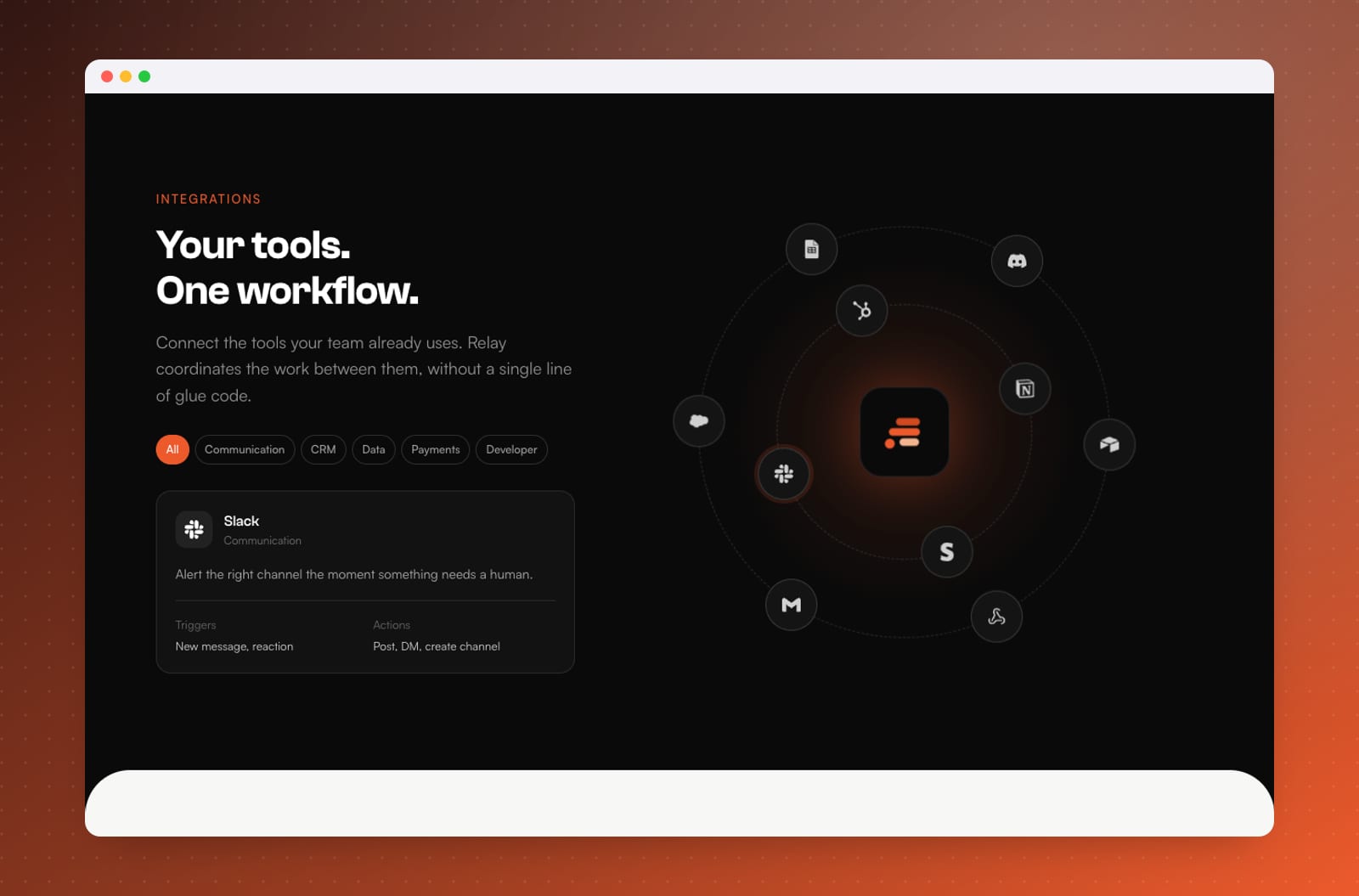
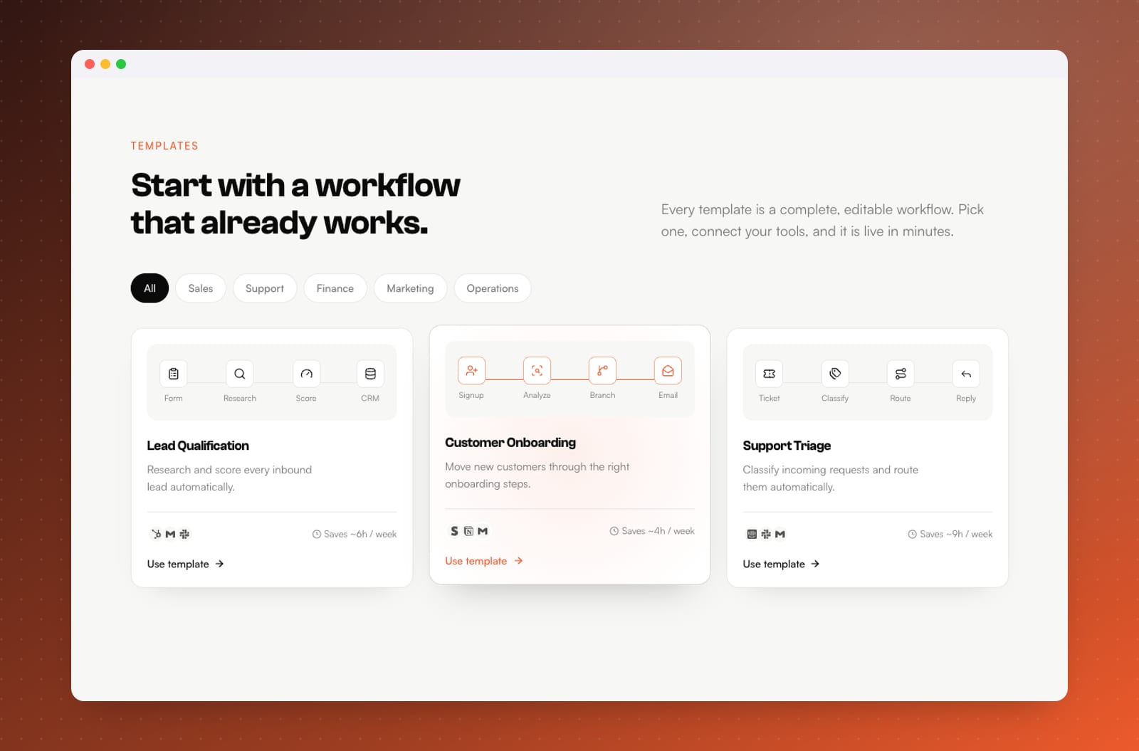
- Templates, integrations, use cases by team, pricing and an FAQ
Design & build
The page alternates between dark ink for the hero, workflow builder and closing call to action, and white and paper sections in between; a fully dark version felt too heavy for a long scroll. There's a single ember-orange accent, Clash Grotesk for display type and Satoshi for body copy. The logo is three staggered rounded bars and a dot.
Under the hood it's React with Vite and Tailwind CSS v4. The product animations share one step-cycle hook, so typing, building and running stay in sync across sections, and the hero's rim-lit glow is built from layered CSS gradients and inset shadows rather than heavy images.
What it delivers
Relay's homepage takes a visitor from "what is this?" to "I can see how we'd use it" quickly. Showing the product at work replaces paragraphs of explanation, the mixed theme keeps a long page easy to read, and the ember identity stands out in a crowded category. This is how I approach SaaS landing pages.