Concept 2026 · Fintech
Montra Payments
A fintech concept that makes cross-border payments feel instant and clear.
Brand Identity first
The brand came before the build.
A wave inside a coin: money moving across borders in one smooth motion. Ink black and teal on dark surfaces, Sora for headlines and Inter for figures, made for a product where trust is the whole brand.
- #02080A
- #2DE2C9
- #5BC8FF
- #EAF6F5
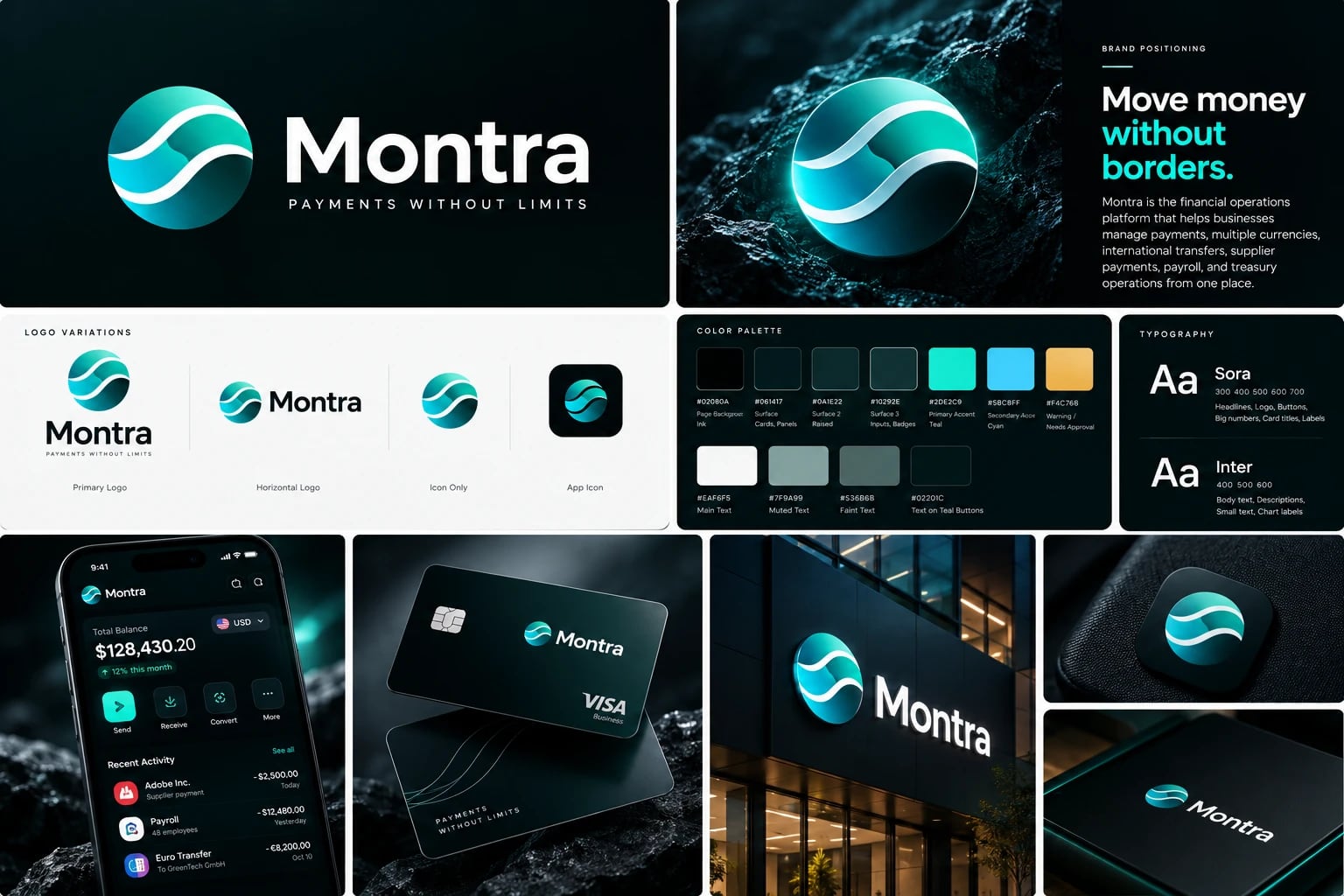 View full board ↗
Story Case study
Overview
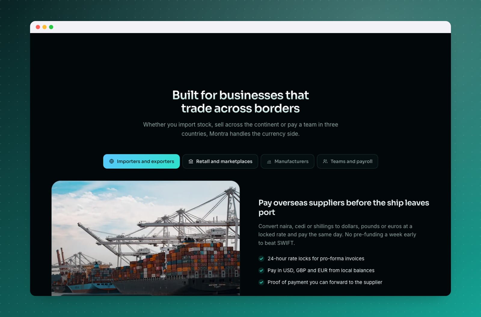
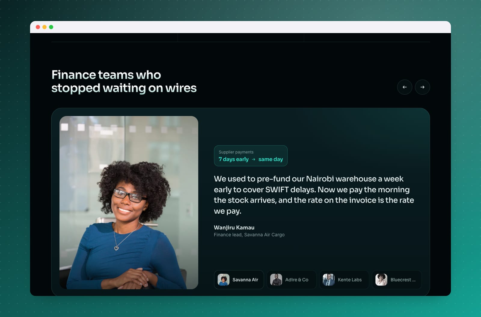
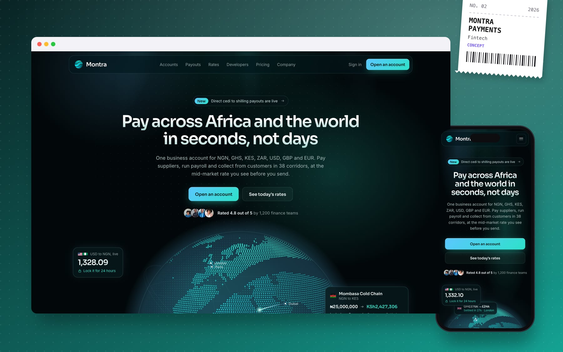
Montra is a self-initiated concept: a cross-border payments brand for African businesses that pay suppliers, run payroll and collect from customers across currencies. I designed and built the fintech website for these cross-border payments from scratch, as a multi-page marketing site covering accounts, payouts, rates, developers, pricing, company and security.
The challenge
Cross-border payments are a trust problem before they are a product problem. Businesses worry about hidden FX margins, slow wires and money getting stuck in screening. The brand needed a site that shows exactly what arrives at the other end, explains how money moves, and speaks to both finance teams and developers, without drowning visitors in jargon.
What I built
- A centred dot-globe hero: a draggable canvas globe whose land dots take the colours of the Montra logo, with payment arcs between African and global cities, currency tokens on a tilted orbit and live rate and payroll cards.
- Live FX rates: rates load from a public currency API with fallbacks and a labelled saved snapshot, so the numbers on the page are real rather than placeholder copy.
- A fee calculator that compares a Montra transfer with a typical bank wire, showing the rate, fee and arrival time.
- A rates page with a live table and seven-day trend, and a pricing page with a live fee table.
- A treasury dashboard mock and product cards (bulk payouts, screening, reconciliation) that show the product rather than describe it.
- A developer section with a payouts code sample and webhook response.
Design & build
The look is ink with a teal-to-cyan gradient, taken from the Montra mark, which I retraced as an SVG sprite. Sora handles headlines and UI, Inter the body and JetBrains Mono the code. The site is hand-written HTML, CSS and JavaScript, assembled from page templates and shared partials by a small Python build into static output. Motion runs on GSAP with ScrollTrigger and Lenis smooth scrolling. Each page ships with titles, canonical tags, Open Graph images and structured data (Organization, FinancialService, FAQPage and breadcrumbs).
What it delivers
The concept shows how a payments brand can earn trust on the first screen: live numbers, a transparent cost comparison and a clear path for both buyers and developers. It is a template for how I approach landing pages for fintech products. Customer names, testimonials and volume figures on the site are illustrative.