Concept 2026 · Media & podcasts
Fireplace Chit-Chat
A podcast brand that feels like a conversation by the fire
Brand Identity system
A brand that's ready for the screen.
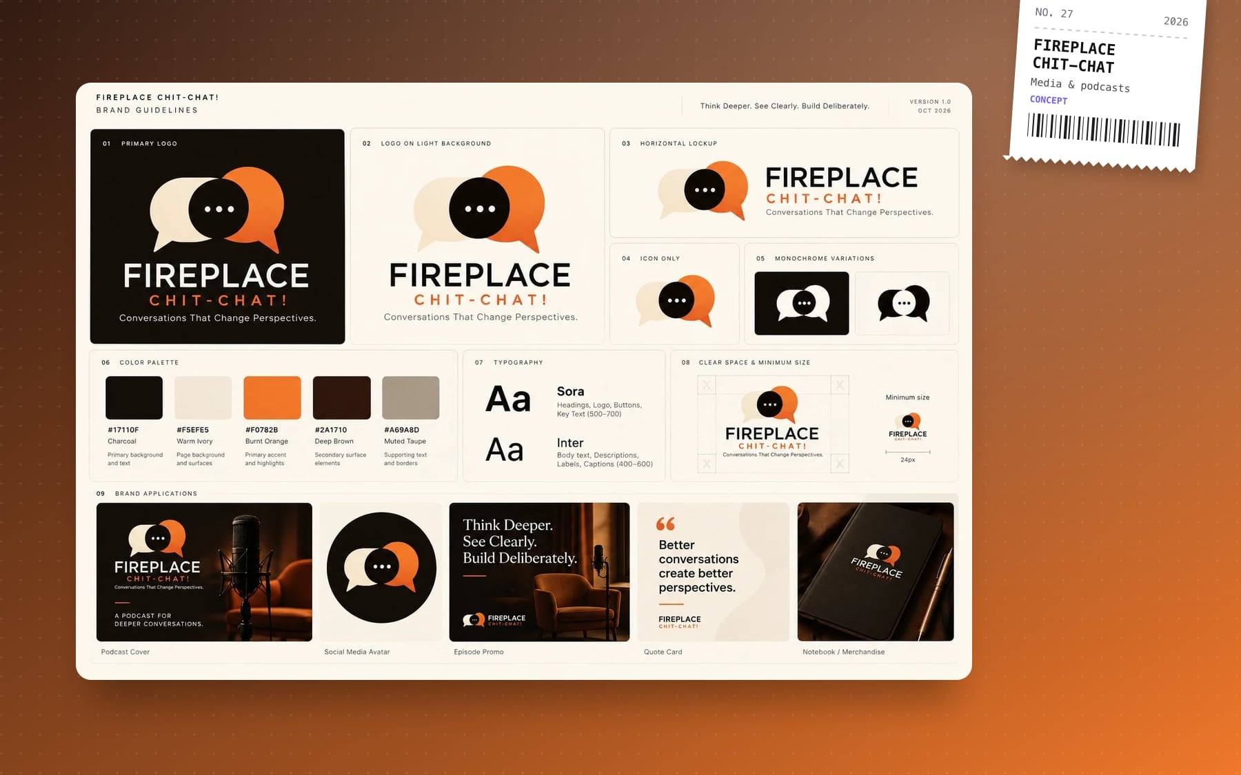
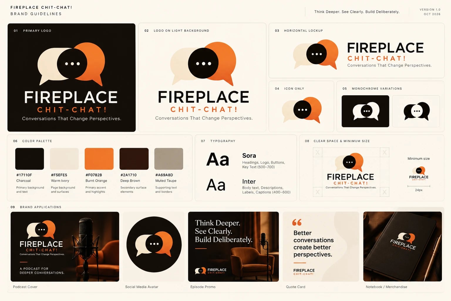
Two overlapping speech bubbles, warm ivory and burnt orange around a charcoal dot: two voices and the space between them. Charcoal, warm ivory, burnt orange and deep brown, set in Sora and Inter.
- #17110F
- #F5EFE5
- #F0782B
- #2A1710
 View full board ↗
Story Case study
Overview
Fireplace Chit-Chat is a podcast for slower, deeper conversations, under the line "Conversations That Change Perspectives." I designed the brand identity from the mark to the episode artwork, so the show looks as considered as it sounds: on a podcast app, a social feed or a notebook on the table.
The idea
Most podcast brands default to a microphone or a sound wave. This one is about the conversation itself, so the mark is two speech bubbles leaning into each other: one warm ivory, one burnt orange, meeting at a charcoal dot that holds the "..." of someone about to speak. It reads as two people and the space between them, and it still works as a 24px avatar.
The identity system
- Logo suite: primary stacked logo, horizontal lockup, icon-only mark and monochrome versions for dark and light backgrounds
- Colour: charcoal, warm ivory, burnt orange, deep brown and muted taupe, a palette taken from a room lit by a fire
- Type: Sora for headings, the wordmark and buttons; Inter for descriptions, labels and captions
- Clear space and minimum size rules, so the mark never gets crowded or shrunk past legibility
- Applications: podcast cover, social avatar, episode promo, quote card and merchandise
Built to ship episodes
A podcast brand gets used every week, so the system is designed around repeatable templates. Episode promos use a cinematic photo with the line "Think Deeper. See Clearly. Build Deliberately." Quote cards turn the best moment of an episode into a post in minutes. Every template uses the same type sizes and colour rules, so a new episode looks on-brand without a designer in the loop.
What's next
The identity is ready to become a website: an episode library, guest pages and a subscribe flow in the same fireside palette. That's how I approach brand identity: design the brand so it's ready for the screen from day one, then build the site on top of it.