Concept 2026 · Real estate
Aster & Co.
Exceptional homes across two coasts, presented with restraint
Brand Identity first
The brand came before the build.
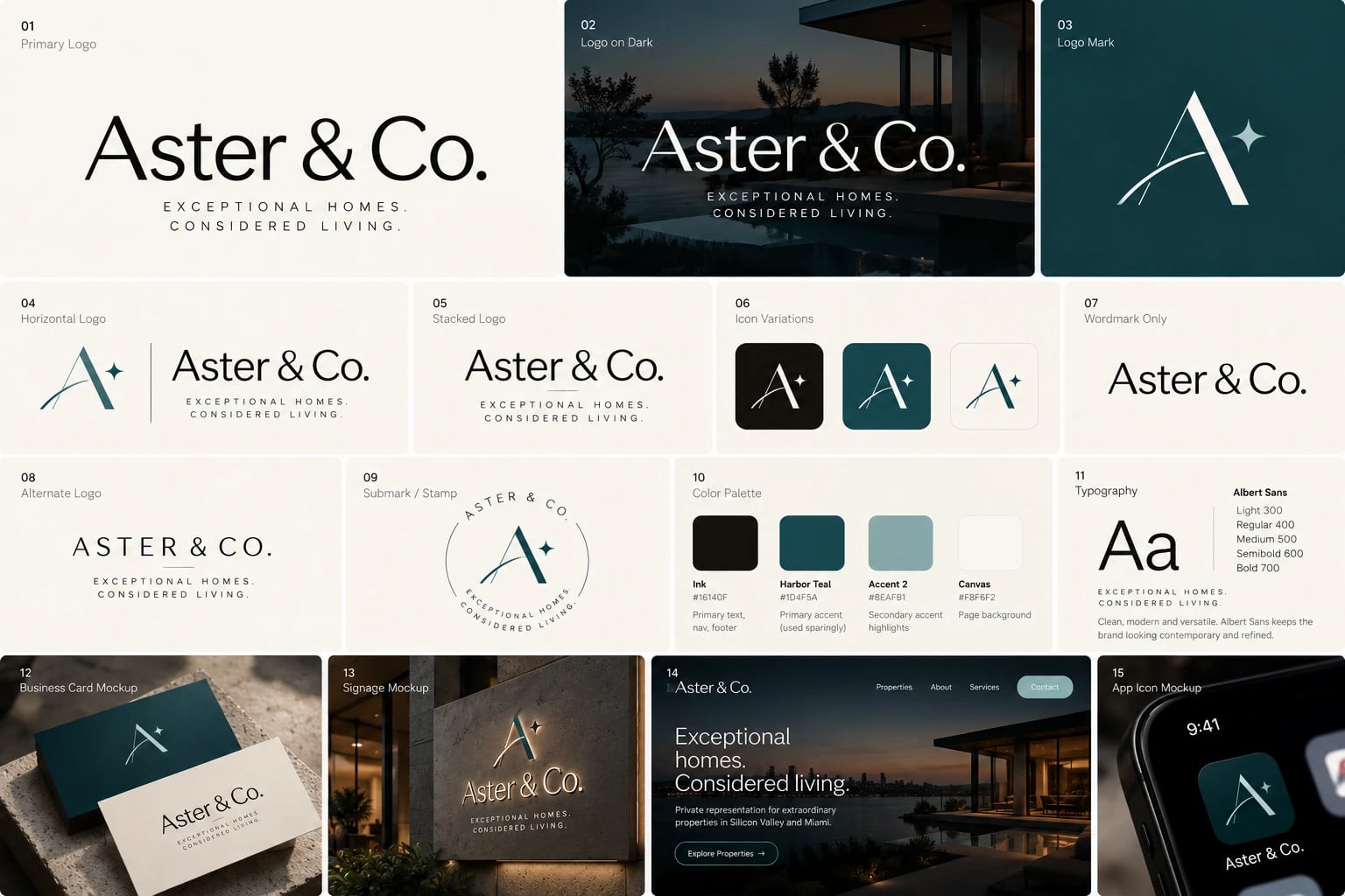
An A drawn with a hairline inner stroke, a sweeping arc and a four-point star, set beside an Aster & Co. wordmark and the line Exceptional homes. Considered living. Ink is the one primary colour, Harbor Teal is used sparingly for accents, on a warm canvas, all in Albert Sans.
- #16140F
- #1D4F5A
- #8EAFB1
- #F8F6F2
 View full board ↗
Story Case study
Overview
Aster & Co. is a self-initiated concept: a private real estate brokerage representing exceptional homes in Silicon Valley (Atherton, Palo Alto, Woodside) and Miami (Miami Beach, Coral Gables, Key Biscayne). I created the brand, from the logo mark to the palette and type, and designed and built a 21-page website covering residences, ten individual listings, neighbourhoods, advisors, selling, a journal and contact.
The challenge
Luxury buyers expect the website to feel like the homes: calm, confident and unhurried. Most brokerage sites do the opposite, with busy search bars, loud colours and stock layouts. Aster & Co. also works across two very different markets, so the site had to present Silicon Valley estates and Miami waterfront homes as one brand without flattening either, and give serious buyers and sellers the practical tools they need without breaking the mood.
What I built
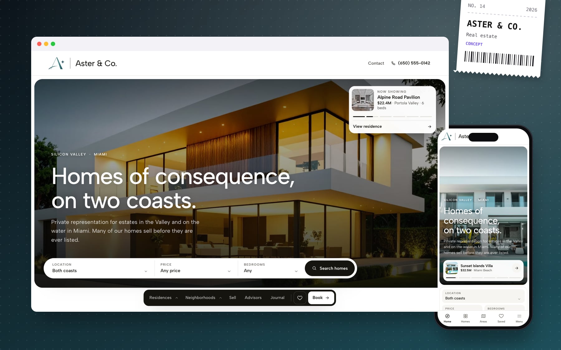
- A slide-led hero across both coasts, with a location search grouped by region
- A dock navigation with photo mega menus for residences and neighbourhoods, which becomes a five-tab bar on phones
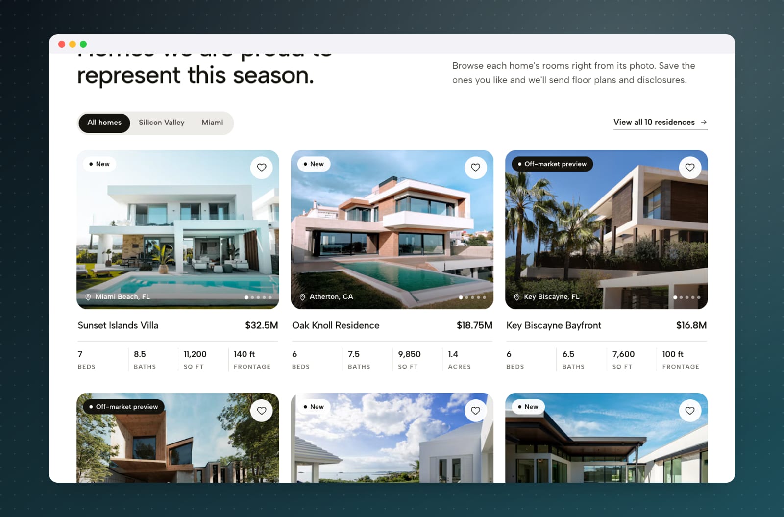
- Residences with a sticky filter bar, card photo scrubbing, a shortlist drawer and a live map with photo pins
- Listing pages with a lightbox gallery, a sticky viewing booker that adds the visit to your calendar, and a cost-of-ownership calculator comparing California and Florida
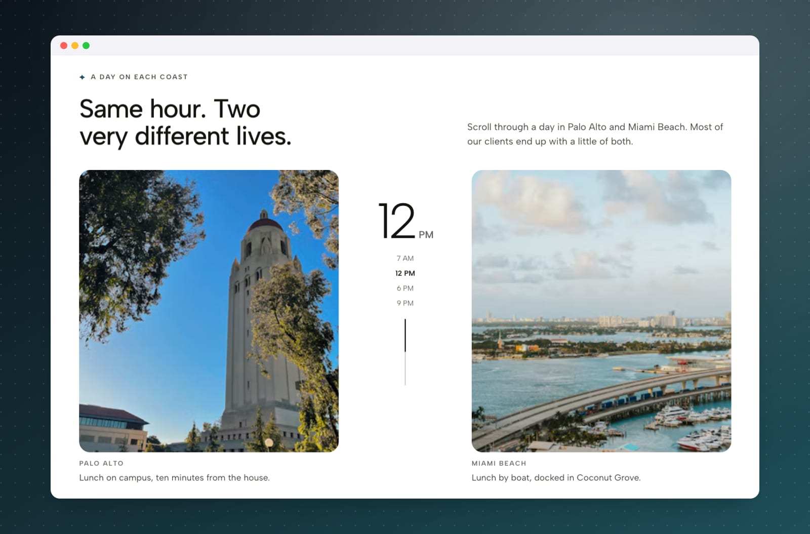
- A valuation estimator for sellers, advisor profiles, live office clocks and local weather and sunset times
- A journal with long-form articles, and the same client-desk call to action and two-coast footer on every page
Design & build
The brand starts from the mark: an A with a hairline inner stroke, a sweeping arc and a four-point star, which also became the small label glyph used across the site. The palette is deliberately strict: ink is the single primary colour for every button and selected state, Harbor Teal appears only in small accents, and everything sits on a white page with a warm canvas tint. Albert Sans carries the whole system. It is a fast static build with gentle reveals on native scroll, tested from small phones to large desktops.
What it delivers
Aster & Co. shows how a high-end property brand can feel premium and still be genuinely useful: buyers can browse, compare, shortlist and book a viewing, and sellers can get a first estimate, all inside one calm, consistent experience. It's a complete brand and multipage website system, from logo and palette to listings and enquiries.