Concept 2026 · Energy
PureRay Solar
A solar site that shows your savings before you book a survey.
Story Case study
Overview
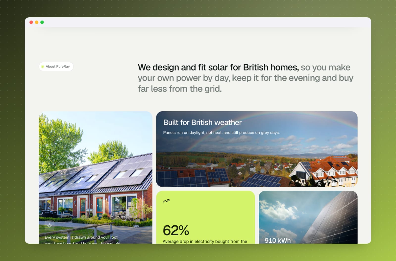
PureRay is a concept brand for a UK solar panel and home battery installer. I designed and built the solar installer website with one job in mind: turn a curious homeowner into a booked home survey by showing, in their own numbers, what solar would do for them.
The challenge
Solar is a big, unfamiliar purchase. Homeowners want to know if it works on a grey British roof, what it costs, how long it takes to pay back and whether they need a battery. Most installer sites answer with stock photos and a contact form. The goal was a site that answers those questions honestly and interactively, then hands the visitor straight to booking.
What I built
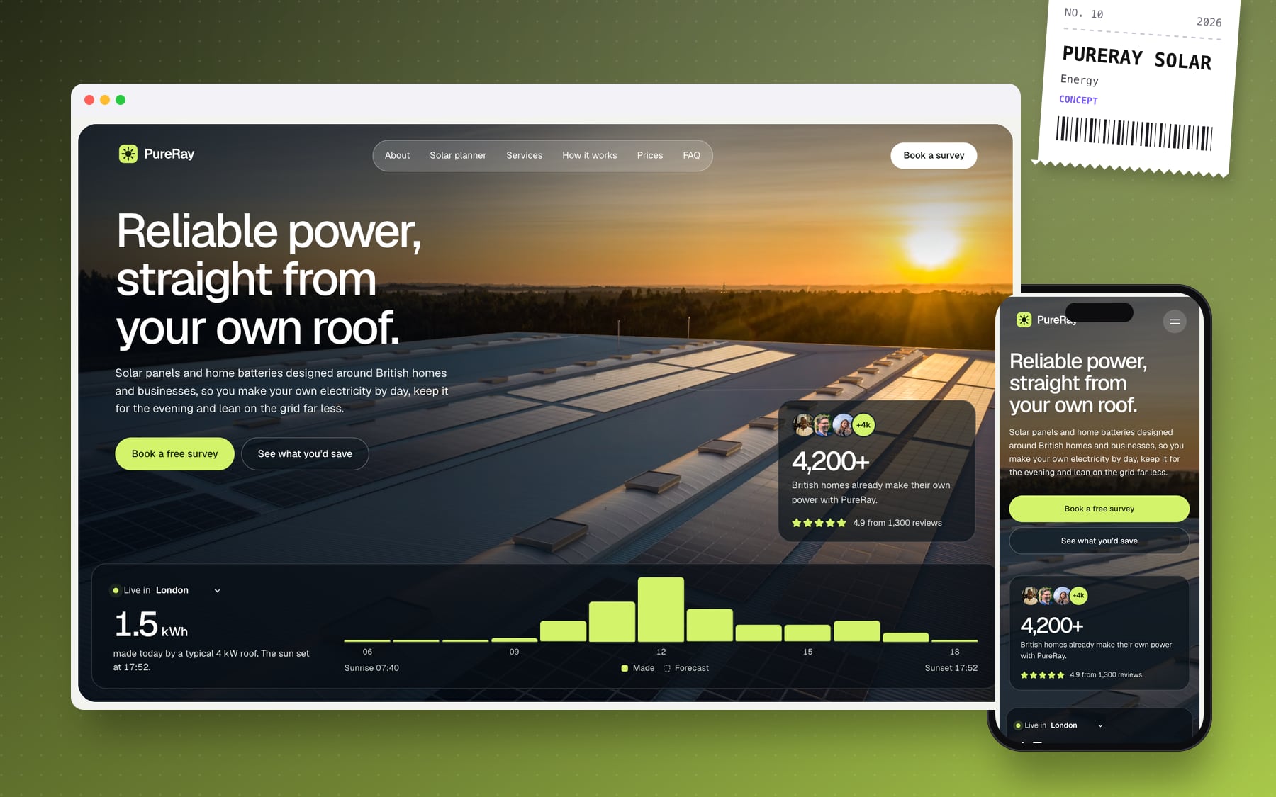
- A rounded photo hero with a glass pill nav and a live "today's sun" strip: hourly bars from the Open-Meteo forecast showing what a typical 4 kW roof is producing today.
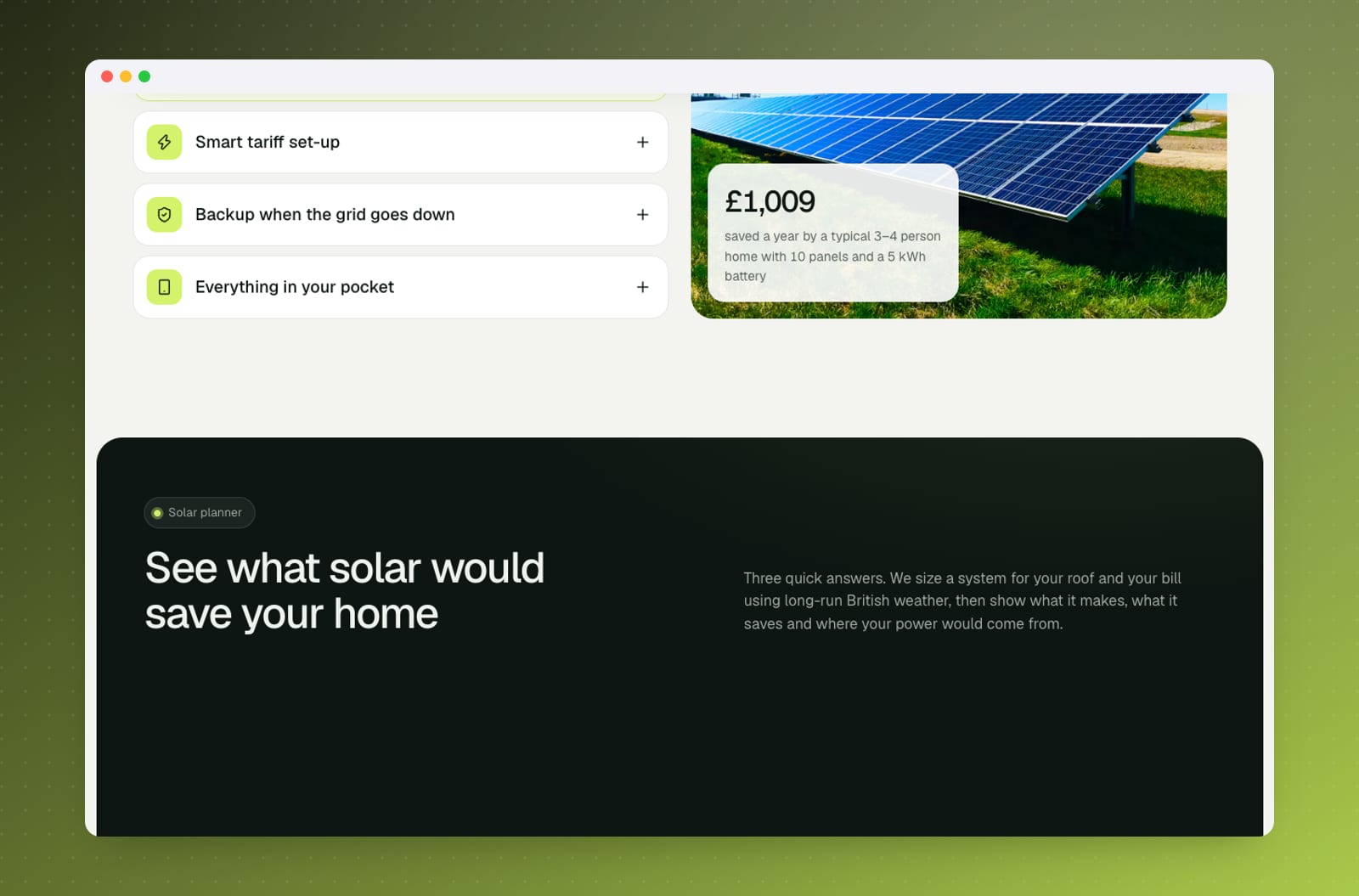
- A three-step Solar planner: choose a city and roof direction, enter a monthly bill and add-ons such as an electric car or heat pump, and get an auto-sized system with savings, payback, where your power comes from, and yearly, June, January and live-forecast charts.
- "Book a survey with this plan", which carries the planner result into a front-end booking flow.
- Services, a four-step process and fixed-price tiers (solar, solar + battery, whole home) so the cost is never a mystery.
- Reviews, an FAQ with a contact card and a photo call-to-action band.
- A nav that hides on scroll down and returns on scroll up.
Design & build
The design uses a soft off-white canvas, deep forest panels and a lime accent, set in Geist, with golden-hour rooftop photography. It is built with Next.js, and the planner runs on a small solar engine that models output from city, roof orientation and household load. Motion is restrained: one staggered hero entrance, sun-strip bars that grow in, cards that fade in on scroll, accordions that animate open and a savings figure that counts up, all respecting reduced-motion settings. I checked contrast (including text over photos) and ran axe-core on the home and booking pages, then audited layouts from 320px to 1920px.
What it delivers
Visitors leave with a realistic picture of their own system and a booking already shaped around it, so surveys start from an informed conversation. It shows how I combine landing pages with useful tools. Reviews, prices and company figures on the site are illustrative for the concept.